Just What is a Chart, Anyway?
Charts are everywhere. We use them to keep tabs on how our children are growing, how we group ourselves demographically and what the weather is going to be for the next five days. Whenever we show how something changes over time or how it breaks down into its component parts, we are using charts. In the investment world, we usually chart price movements over time. Technical analysis starts with this basic concept and works up from there.
A Picture is Worth a Thousand Words
Technical analysis is based on the premise that in order to know where prices are going, we must know where prices have been. In the early days of stock trading, the only way to know where prices have been was to read the ticker tape. Only a very few had access to the tape.
Since most of us are not working on the floor of the exchange, we are blessed with the computers to read the tape for us and send the prices to our home screens and newspapers. However, even getting an idea of the market from these quotes is nearly impossible. The more stocks (or mutual funds, bonds, and futures) we try to follow, the more impossible it is to do our investment research. We can keep track of only so much information in our heads.
Enter the chart. By plotting the closing prices of stocks or other instruments on paper (or a computer screen) each day we can see at a glance not only what the price of the stock is but how it got there. Sure, MicroGiant is trading at 65 up 1/2 but was it 60 last week or 70? Charts put all the data in one place so that a visual animal such as a human being can quickly assimilate them.
What Good is That?
Knowing if a market is moving up or moving down helps investors buy only those issues that have the odds stacked in their favor. The bottom line in all markets, whether they be financial, real estate or breakfast cereal, is that when demand is greater than supply, prices will rise. A chart with a positively sloped price line is exhibiting excess demand. It is far better to buy a stock when demand is greater than supply than the other way around.
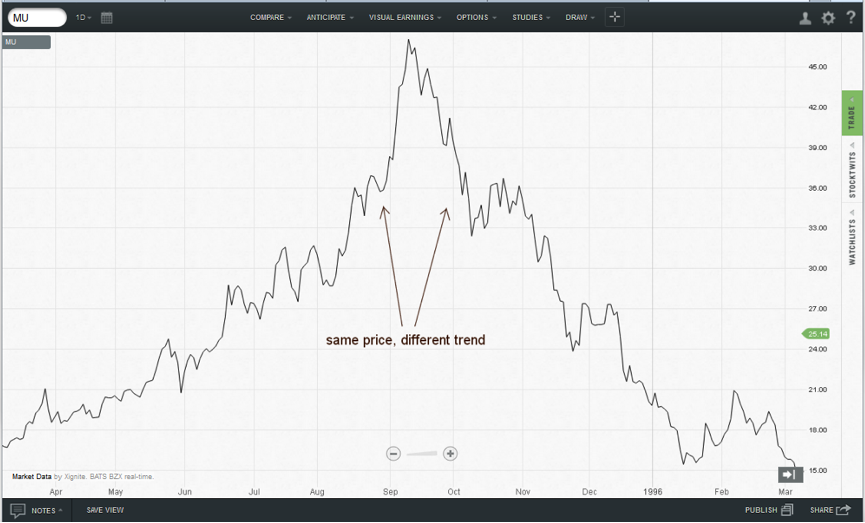
For an extreme example, we can go all the way back to 1995 for a chart of Micron Technology. On the way up, when all the news was positive, buying high and selling higher was a good strategy. In late 1995, when the price had fallen 25 points, the chart shows prices bouncing back a bit. Certainly, if the stock was good at 90, it’s a steal at 70. It wasn’t even a steal at 50.
Technical analysis has many tools that it can apply to charts. Many of them are esoteric or proprietary and never make it to the mainstream. Of those that are generally available to the public, the majority are used infrequently. The bottom line is that any investor can be armed with a small number of technical tools and be able to enhance his or her performance in the markets. The goal is not to be the best investor there ever was. The goal is to enhance portfolio returns in a way that is consistent with an individual’s needs and risk profile.
Tea Leaves? Crystal Ball?
Want to insult a market technician? Ask him what he sees in his crystal ball. Technical analysis cannot see into the future any more than can reading the bumps on your head. It does not predict. It is more about crowd psychology and probability. The markets are inhabited by the masses of hedgers, speculators and investors that, in similar situations, do the same things over and over again. Charts simply show what the current situation is and the analysis lays out the probabilities for various possible outcomes.
The catch phrase for technicians has always been “history repeats.” The latest revision of this phase is “history doesn’t repeat, it rhymes.” Events do not unfold the exact way every time but the odds of similar paths are quite high.
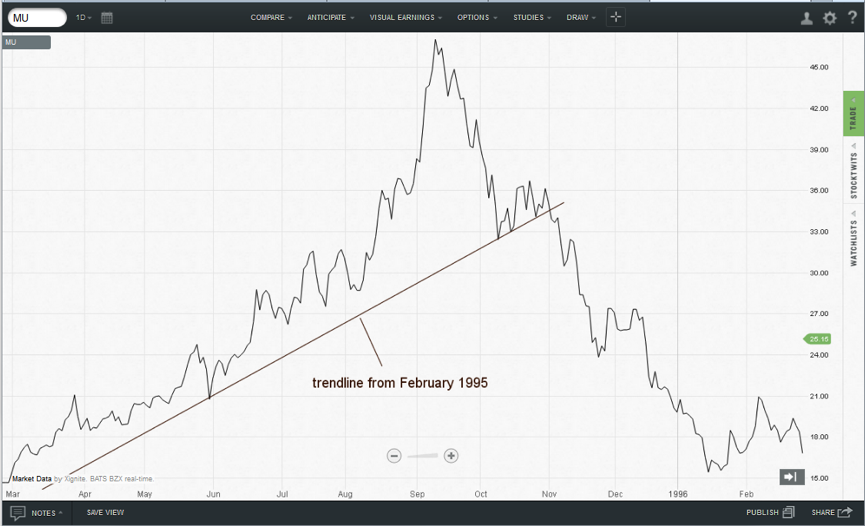
Let’s apply one simple tool to the Micron Technologies chart. A simple trendline (basically a stick figure drawing of the stock’s price action) was broken to the to downside in November 1995. History tells us that when this happens, the likely event is for the market to keep going in the direction of the break. Anybody who thought they got a good deal at 70 a month earlier was told very clearly that they were wrong.
Technical analysis is not always right. Nothing is. Every technical tool in the world can agree that Joe’s Customized Research Company is a stock on the verge of its great bull market when a little thing like the Internet comes along to change the rules of the game. Technical analysis will quickly point out that the original forecast was wrong. In the investment world, as in major league baseball, being wrong 60% of the time makes us very wealthy. Doesn’t a .400 batting average make a league leader and highly paid free agent?
Of course, losing 60% of the time with even money odds is a bad game. Technical analysis requires the investor to follow the age-old adage of cutting losses and letting profits ride. Four $10 winners swamp six $1 losers and this is how traders make serious money. Long-term investors should really shoot for portfolio enhancement rather than aggressive activity but the key is that they should not be afraid of a loss. A disciplined investing approach will not be sidetracked by them in the long run.
What about Earnings?
There is no question that what a company earns directly impacts its value. Technical analysis does not consider earnings, financial statements, news and input prices directly. Rather, it assumes that all of that information is in the current price. A better definition is that price is the sum total to date of the actions of everyone in the marketplace. Somebody was following earnings and bought or sold the stock. Somebody else was watching the news wires to find developments affecting the company. Input prices are followed by others. If the price of apples and wheat flour go up, the margins at Aunt Betty’s Fruit Pie Company will be squeezed. This is technical analysis.
In the credit markets, there is always the fundamental argument that interest rates are affected by the actions of the Federal Reserve and changes in inflation. Doesn’t the statement that the Fed has lowered the discount rate for the past six quarters mean that the discount rate chart is trending down? What happens when the consumer price index rises? This, too, can be charted and both correlate to interest rates. A chart of interest rates themselves captures the actions of those following these supposedly fundamental data.
Most investors are using technical analysis already without even knowing it.
Conclusion
Charts are not mysterious. They are tools that allow us to keep track of more opportunities and see quickly when it’s time to change strategies. They do not predict the future but they are valuable in determining the probabilities of success whether we buy, sell or hold.
And when you think about it, the decision to buy, sell or hold is the only thing any of us can actually control when it comes to the markets.
Disclaimer
It should not be assumed that past performance is any guarantee of future results. Results obtained from any information provided in this article are not guaranteed to be profitable. It should be understood that investing or speculating in the financial markets involves risk and may result in either a partial or total loss of one’s investment capital. The information presented in this article is believed to be reliable, but cannot be guaranteed as to its accuracy or completeness.
ChartIQ Inc. and/or its principals and employees will accept no liability whatsoever for any loss arising from any use of the information contained in this article. ChartIQ Inc. does not offer trading advice of any kind and we are solely involved in the business of financial software development.
Reproduction, duplication, or redistribution of the indicators or any material in the Resource Center, in any form, without prior written permission from ChartIQ, Inc. is strictly prohibited.
Other brand and product names used in this article may be registered trademarks of their respective owners. Their use is for identification purposes only.


