The Basics
Creates an envelope around a moving average to find overbought or oversold conditions, to smooth the price trend and as an indicator of price breakouts.
Indicator Type
Trend follower
Markets
All cash and futures, not options
Works Best
All time frames in trending markets
Formula
Lines are drawn a percentage or number of points above and below a moving average.
Parameters
 Parameters often match the user’s moving average preferences with a 50-period simple moving averages and 5% offset (shift) being common for stock and commodities traders. Bond and forex traders might use smaller averages. More volatile markets might use a wider percentage.
Users setting stops by points rather than percentages might use the points option instead.
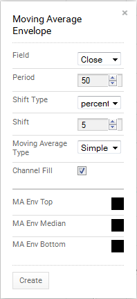
ChartIQ defaults to a 50-period simple moving average of the close with the bands drawn at 5 percent above and below a simple moving average. You can select other fields such as high and low and other types of averages such as exponential or weighted.
You can select to fill in the bands to highlight them against the background of the chart or leave them hollow for a cleaner look.
You can also select colors for the upper, lower and median lines by selecting the appropriate box to bring up a color palette. The color for the average (median) determines the color for filled bands.
Theory
Moving average envelopes create a “crayon” approach to moving averages rather than a sharp point pen. As such, moves above the upper line or below the lower line are more meaningful that moves through average itself. Price action often moves through averages even as there are no changes in range or trend. This problem can be avoided with envelopes.
Interpretation
Breakouts above the upper band, for example are bullish when the bands themselves are relatively flat. In trending markets, where moving averages are more useful, the bands can indicate overbought or oversold.
It may also be useful to use envelopes based on the high price in rising markets and on low prices in falling markets. That will, of course, requite the user to change the parameters in a subjective way when the trend changes.
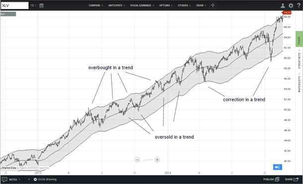
The chart of the SPDR Healthcare ETF shows a 50-day average with a 5% envelope. During a trend, small dips to the moving average can be used a buy points. Rallies to the upper band can be used to take quick profits.
Larger dips to the lower band indicate more important corrections and possible buy points for longer-term traders. Breaks below the lower band would be used to exit the long position or initiate shorts.
How do you know which dip is which? Other indicators should be employed to help. And keep in mind that bands and averages are guides, not trading triggers all by themselves.
Math
Envelopes start with any moving average type (see Moving Averages for formulas) and then creates an offset x% above or below the average or an offset Y points above or below the average.
For percentage envelopes:
Upper band = moving average + x%(moving average)
Lower band = moving average - x%(moving average)
For points envelopes:
Upper band = moving average + constant
Lower band = moving average - constant

