What is it?
Earnings season has always produced volatility in equity prices, leading many technicians to sit on the sidelines completely, or take overly cautious positions. The “Wall St. Consensus” has always given us numbers for what analysts expect a company’s release to say, and now Estimize gives us a much more accurate set of crowd expectations. In the past, these have just been numbers for fundamental investors – completely out of context of the price action. Now with ChartIQ, you can visually see two critical things:
- How the price action has reacted to earnings/revenue releases in the past
- What the market expects for future quarters
Armed with this information, you’ll be able to make more informed trades going in to an earnings release.
The ChartIQ earnings package is made up of two components – the Miss/Beat Indicator™ and the data table.
Introduction Video
What is Estimize?
Estimize crowdsources quarterly corporate earnings and revenue estimates from the sell-side, the buy-side, as well as independent contributors. By leveraging a larger and more diverse community of contributors than traditional Wall Street data providers, Estimize has created a more representative and accurate data offering representing 1,500+ stocks. Institutional investors and professional traders utilize Estimize data for idea generation and risk management.
Estimize has over 8,000 contributing buy-side and independent analysts covering 1,500 stocks including 90% of the S&P 500 and 80% of the Russell 1000. Estimize has statistically proven to be more accurate than Wall St 75% of the time.
To learn more about Estimize, please visit www.estimize.com.
Miss / Beat Indicator™
The Miss/Beat Indicator is designed to visually highlight when a company has beat, met, or missed market expectations – that of the Wall St. Consensus as well as the Estimize crowd. When you enable the Miss / Beat Indicator from the Estimize menu, you can choose to see earnings or revenue – you can also enable two panels, one for each.

The indicator is made up of a few critical components:
- The vertical dashed line – this connects the indicator to the price action on the day of the release, so you can see what impact the news had on the market.
- The long, dark line – this shows where actual earnings came in. By using the crosshairs, you can mouse over the line and see the actual number.
- The short, thin lines – these represent the Wall St. and Estimize estimates going in to the earnings release.
- Green or red shading – these show the miss or beat vs. actuals.
While you can hover using the crosshairs to get exact numbers, the data table (see below) is better for that. The Miss/Beat Indicator is designed to give an at-a-glance perspective. As such, it’s often best to zoom out a bit and look at the big picture.
Here’s Apple (AAPL) EPS data, visualized with ChartIQ
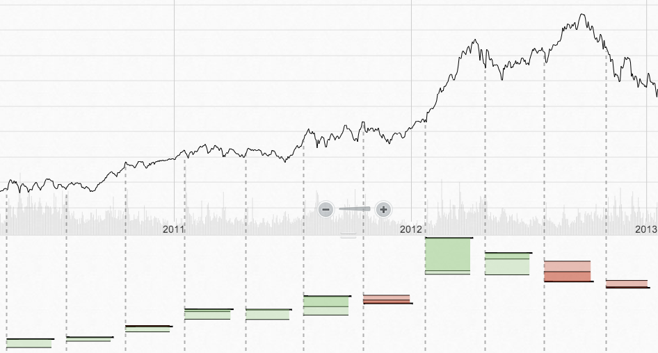
Here we can see 3 years of price action along with a pattern of earnings beats… followed by faltering performance in 2012/2013
And another great chart, this time Ford (F) EPS visualized along with the price action:
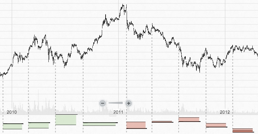
Here we can see investor confidence – and price – gain momentum as Ford beats quarter after quarter… and then watch as confidence and price falls.
The Data Table
Once you’ve spotted the broader trend and how the market treats a particular company’s performance, it’s time to look in to the details. The data table contains all the key information for a more detailed analysis.
There are two main sections of the table – one for earnings and one for revenue, with three lines each (actual, Estimize, and Wall St. estimates). Off to the right you can also see quarter-on-quarter performance, annualized totals, and price/earnings ratio (P/E)
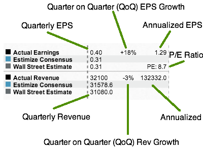
Let’s take a look at a great example from Ford (F):
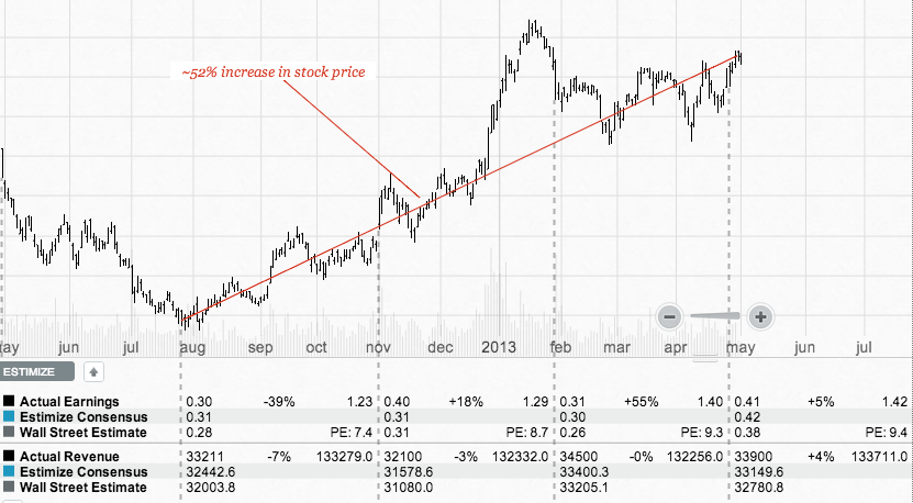
Here we can see four quarters of Ford earnings releases. As Ford narrowly beat the Street every quarter, market confidence grew and rewarded Ford with a P/E that expanded from 7.4 to 9.4! And the price went up ~52% in that same period of time.
